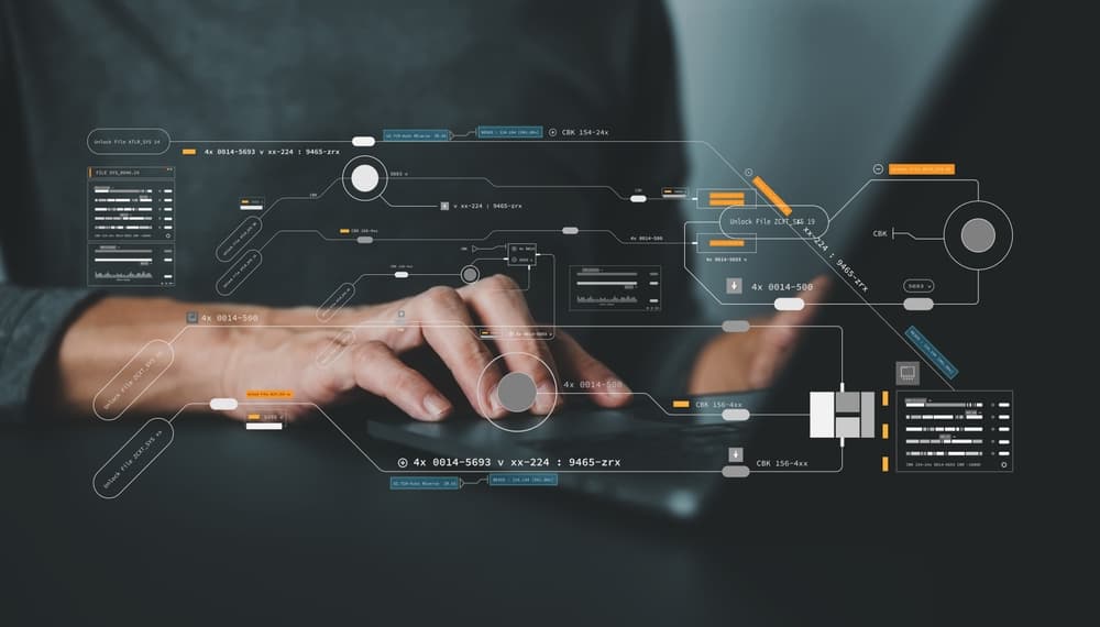
We spent the last few years heads-down on the platform itself, helping teams in banking, SAP, mainframes, and legacy environments that most tools quietly avoid. The brand? That stayed on the backburner longer than we'd like to admit.
Not because we didn't care. Mostly because shipping actual product felt more urgent than debating color palettes.
At some point though, the gap between what TestResults does and what TestResults looked like became hard to ignore. So we brought in The Branx and spent a few months fixing it.
The Logo: actually seeing
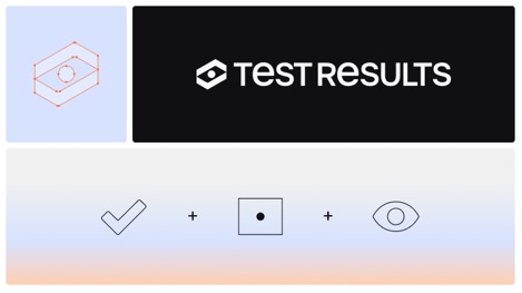
Our new logo icon nods to our core technology. By combining two checkmarks, we’ve formed a box around a pointer. At first glance, it mimics an eye: a direct reference to our platform’s ability to "see" and interpret the screen rather than just reading raw code.
The branding concept: Visualizing the interaction
The new identity, developed by the branding agency The Branx, is built around what TestResults actually does on screen. Two elements carry that idea:
- The box: How our system locates interface elements like buttons, fields, and toggles, by looking at them the way a human would
- The pointer: The action that follows, with the logic and intent of a real user
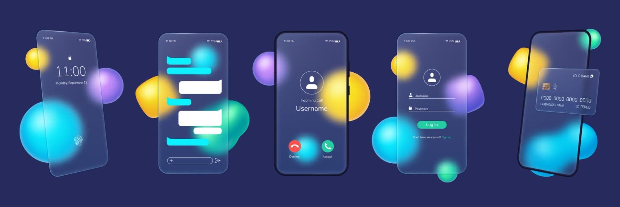
You see both when watching TestResults run a test case.
Colors and typeface: Energy and precision
- The core: Sophisticated black, white, and shades of blue provide an enterprise-grade foundation.
- The spark: "Orange Pop" and "Fresh Green" accents bring energy and vibrancy.
- The font: We chose Onest, a sans-serif typeface that strikes the perfect balance between digital precision and human approachability.
TestResults: Innovation and authenticity
In regulated industries like banking and MedTech, a software issue isn't just a bug ticket. It's a failed audit, a delayed product release, or worse. These teams don't have the luxury of "good enough." They need tools that interact with software the way real users do, and hold up when an auditor asks questions.
That shapes how we think about the product, and it's what you see reflected in the new brand.
- Innovation: Our vibrant accent colors reflect a progressive and dynamic company, moving as fast as the software we test.
- Authenticity: It proves that technology can be approachable without losing the sophistication required for enterprises, communicating the real-world logic of our software. We don’t sell an illusion; we’re realistic about technology.

Our new visual identity proves that enterprise-grade sophistication doesn't have to be cold or overly complex.
While our look and feel has evolved, our core vision remains unchanged: to increase software quality worldwide. This rebrand is more than a fresh coat of paint: it’s a promise to keep pushing the boundaries of what’s possible in test automation.
A special thanks to the team at The Branx for helping us translate our technical vision into a visual story.